Figures and color processing in cosmetics packaging design technology
Figures and color processing in cosmetics packaging design technology
1. The graphic design of cosmetics packaging
The cosmetics packaging is a large graphic category as a overall logo, text, texture, and graphics images, because in the eyes of the audience, the appearance of the entire packaging is a picture, and all kinds of elements are only part of this picture.
In the packaging design of cosmetics, the overall concept of design must be focused on. Cosmetics are generally appeared from a whole set or a series, and there are several or dozen types. They are composed of different materials and different specifications of different specifications of different materials. Based on this situation, when designing, there must be overall considerations. In this way, the effect of series and integrated can be obtained. Here are the main graphics elements in the design of cosmetics packaging.
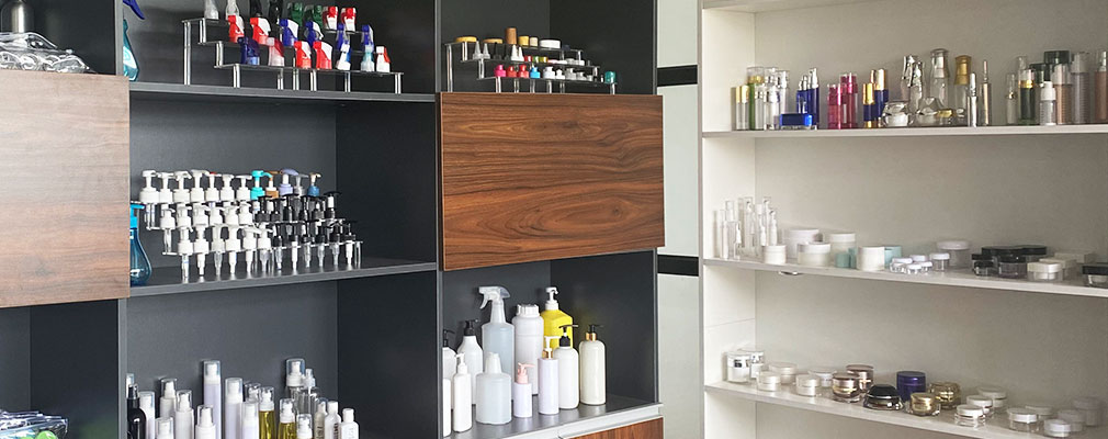
1.1 Graphic image
The graphics images on cosmetics packaging should be consistent with the product theme, so that a lot of information on the product can be displayed to consumers, so that consumers have a more overall impression of the product in a very short period of time. The expression forms of graphics images include: portrait graphics, abstract graphics. The figurative figures are accurate and realistic in vision, and have high credibility, which can make the audience directly understand the shape, material and color of the object, and to the greatest degree of trust. Abstract graphics are graphics composed of points, lines, and faces, including geometric graphics. Abstract graphics are manifested as symbolic in cosmetics packaging design. Underly implicit, or enthusiastic, or quiet and so on. No matter what kind of association is, the theme of cosmetics should be appropriately expressed.
1.2 logo
In cosmetics packaging design, graphic images are important, but as a symbol symbol of the corporate image, it should play a role in memory. Remembering the logo is equivalent to remembering this enterprise so that the company's popularity is increased invisible. Generally speaking, the characteristics of the enterprise or brand are fully displayed on the packaging graphics, which can make consumers immediately identify. Fully display is not that the location and area account for a large area, but that the graphic of the sign is in a strong visual attention.
1.3 Font image
In any packaging design, fonts are indispensable. Text occupies the main position of visual information transmission. It not only clearly defines the packaging content, but also enriches the form of the picture, making the overall graphic more full. The fonts in cosmetics packaging are generally relatively small, mainly explaining, such as trademarks and products.
Production license number, product use, production date, shelf life, production factory name and factory address, capacity or weight, fragrance type, main raw materials, use methods, safety warnings, product storage conditions and methods, etc., but in fact A large number of instructions and precautions are placed in the box as a separate page. In addition to the necessary explanation fonts on the box, the other is mainly to highlight the image personality of the brand, establish the brand image, and auxiliary logo display. Sometimes it will be combined with the graphic. Consumers quickly identify and have effective purchase behavior.
1.4 White
Leave white in cosmetics packaging can also have a good effect. It gives people the space and a kind of ethereal first feeling. It is properly used, which is simple and elegant. Leave white can focus on expressing a mood or completing the atmosphere of the picture, which is the phenomenon of meaning. Pay special attention to leaving white in cosmetics packaging design, which can create restrained, elegant, fresh or mysterious visual effects, so that the packaging design has deeper connotations and interests and higher realms.
2. The principle of cosmetics packaging design should be followed
2.1 Unity of form and content
Cosmetics packaging design should be unified in form and content. For example, the cosmetics packaging design for Volkswagen consumers should show the atmosphere that is easy to get close and express its quality. There is no need to show an atmosphere of too elegant and nobles. In the face of higher income and higher cultural levels, the packaging design of cosmetics must not only reflect high quality, but also create an elegant, high -end and special atmosphere.
2.2 Fully display
When the cosmetics packaging design uses pictures to display the content, it usually uses more realistic characters. Fully show the effect of reappearing the product or after using the product, forming an unforgettable visual impression.
2.3 series
Cosmetic packaging design is usually the same layout, the same color, unified trademark and design form to express a series, generating internal connections, giving people a harmonious and unified impression. Consumers can recognize and choose what they are familiar with at a glance and choose what they are familiar with. Brand series. Whether it is graphics or color, in the series, the design is continuously used in these elements.
2.4 Basic effect
Cosmetic packaging design also reflects the basic effects of packaging. For example, it is convenient for product display and sales, and only the texts and pictures of the packaging itself can sell to customers. Press, anti -crushing and so on.
2.5 positioning
Cosmetic packaging design must pay attention to the positioning and positioning, so as to play a role in target consumers well. This includes brand positioning, product positioning, and consumer positioning. If a cosmetics, in its marketing strategy, the design should show whether the cosmetics of this brand of cosmetics, whether it gives people a strong sense of trust; what kind of product is it; whether it is sold to men or women or children It is a special product or a general product, it should have a clear explanation. In this way, we can design it with purpose.
3. Color design in cosmetics packaging
Color occupies a particularly important position in packaging design. In the fierce competition market, it is necessary to have the visual characteristics that distinguish the products from other products, and it is more rich in the charm of consumers, stimulate and guide consumption, and enhance people's memory of the brand. This is inseparable from the design of color design. Use.
The color design of the packaging:
(1) Whether the packaging color can be clearly identified in competitive products;
(2) Whether it is very good to symbolize the product content;
(3) Whether the color is harmonious and unified with other design factors, and effectively represent the quality and portion of the product;
(4) Whether it is accepted by the purchase of goods;
(5) Whether it is a high degree of brightness and can have a good role in the text;
(6) What is the effect of a single packaging and the stacking effect of multiple packaging;
(7) The color is in different markets, and the different display environments are full of vitality;
(8) Whether the color of the product is not limited by color management and printing, and the effect is as one.
These requirements are undoubtedly practical in the practice of the color design of the product packaging. With the diversification of consumer demand and the segmentation of the commodity market, the requirements for brand packaging design are becoming more and more stricter and meticulous. In order to better grasp the different requirements of different types of product packaging color design, we can divide the consumer goods into three categories and put forward specific requirements for color design:
The first category is luxury goods. Such as high -end perfumes, soaps in cosmetics, and women's clothing; men such as cigarettes, alcohol, high -grade candy, chocolate, exotic specialty specialty products, etc. This product specially requires a unique personality. Color design needs a special sense of atmosphere, high price, and preciousness.
The second category is the foods required for daily life, such as canned food, biscuits, condiments, coffee, black tea, etc. The color design of this type of product packaging should have two features: (1) to cause consumers' appetite, (2) deliberately highlight the product image, such as mineral water packaging uses sky blue, implies coolness and purity, and uses full transparent plastic. Bottle, fully display the characteristics of the product.
The third category is popular products, such as low -end cosmetics, soap, sanitary protection supplies, etc. This type of commodity is positioned in the popular market, and its packaging color design requirements: (1) show the sense of atmosphere that is easy to get close; The brand.
4. Conclusion
Cosmetic packaging design often moves with the aesthetic trend of society. It not only has the characteristics of use, but also a symbol of quality of life and life taste. "The hint of the image is more satisfied than the science of quality." The excellent shape can produce affinity and stimulate people's desire to buy. Only excellent graphics and color design can make cosmetics full of temptation, giving people visual and psychological beauty, satisfying people's subjective spiritual needs, and producing the sense of coordination of the main and guests to achieve purchasing behavior. Therefore, when we are designing cosmetics, we must fully appreciate the consumer's psychology, and use the needs of target consumers to design graphics and color design, explain the connotation and taste of design in a manner and modern way, design the target consumers Satisfied product packaging. While reflecting product ideas, it forms an image and association to cater to consumer awareness of the new era.